Column
Bean Counting >>
Hypothetical tonnages generated by seeded randomizer. GHG emission rates will be sourced from EPA’s WARM v. 15 for food waste in short tons (to correct to metric).
Tonnages by Location
| TreatmentTYpe | Emission (CO2equiv/t Food Waste) | Facility ID | Food Waste (t/year) |
|---|---|---|---|
| AD-leachate | -0.02 | 9 | 1277.6667 |
| AD-SSO | -0.04 | 13 | 235.6667 |
| AD-SSO | -0.04 | 14 | 7997.6667 |
| Incineration | -0.13 | 6 | 7949.4944 |
| Incineration | -0.13 | 7 | 2219.7040 |
| Incineration | -0.13 | 8 | 1454.4256 |
| Compost | -0.12 | 10 | 38253.0000 |
| Compost | -0.12 | 11 | 2200.3333 |
| Compost | -0.12 | 12 | 53311.0000 |
| Landfill | 0.50 | 3 | 0.0000 |
| Landfill | 0.50 | 4 | 48.2480 |
| Landfill | 0.50 | 5 | 1982.2824 |
Massive Un-mangling >>
Mind-mapping/Flowcharting the paths using DiagrammeR
Source separated food waste paths
Mixed garbage paths
Lay of the Land >>
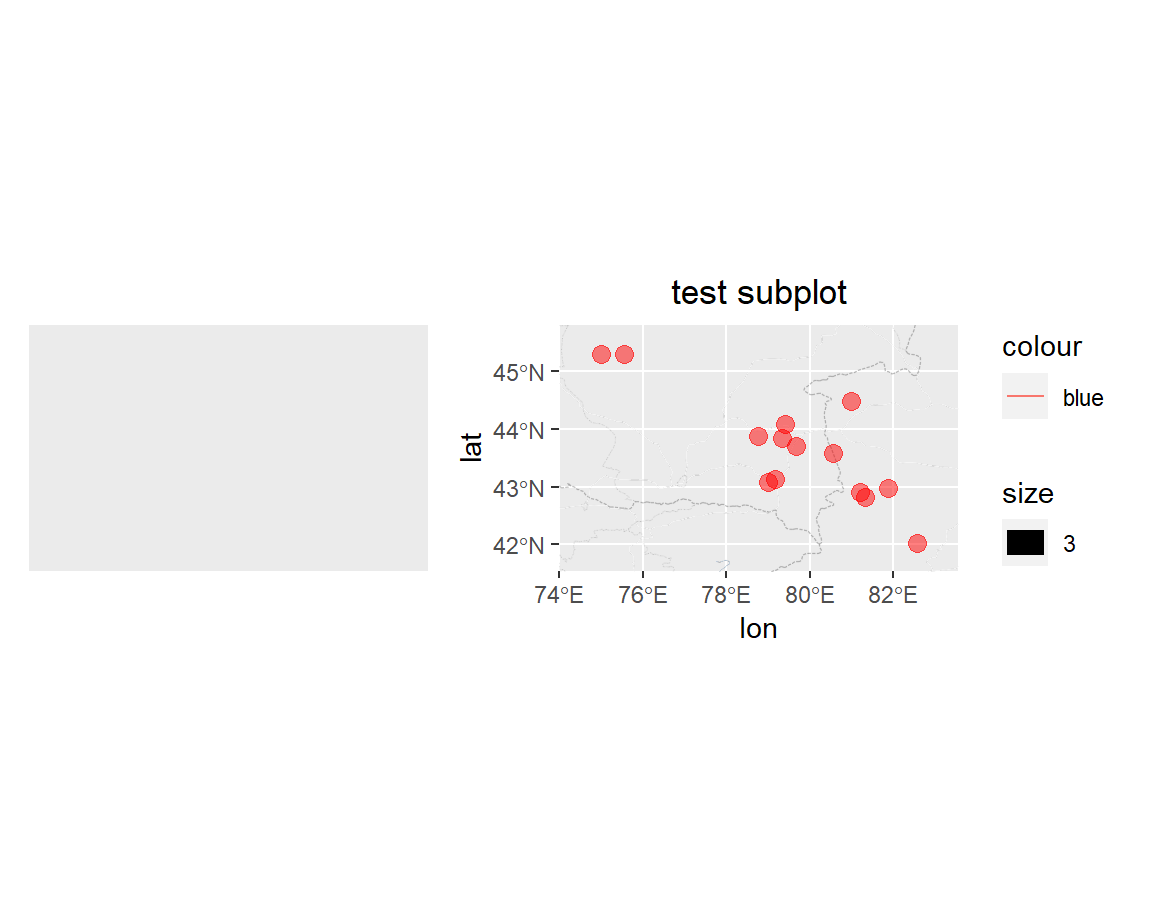
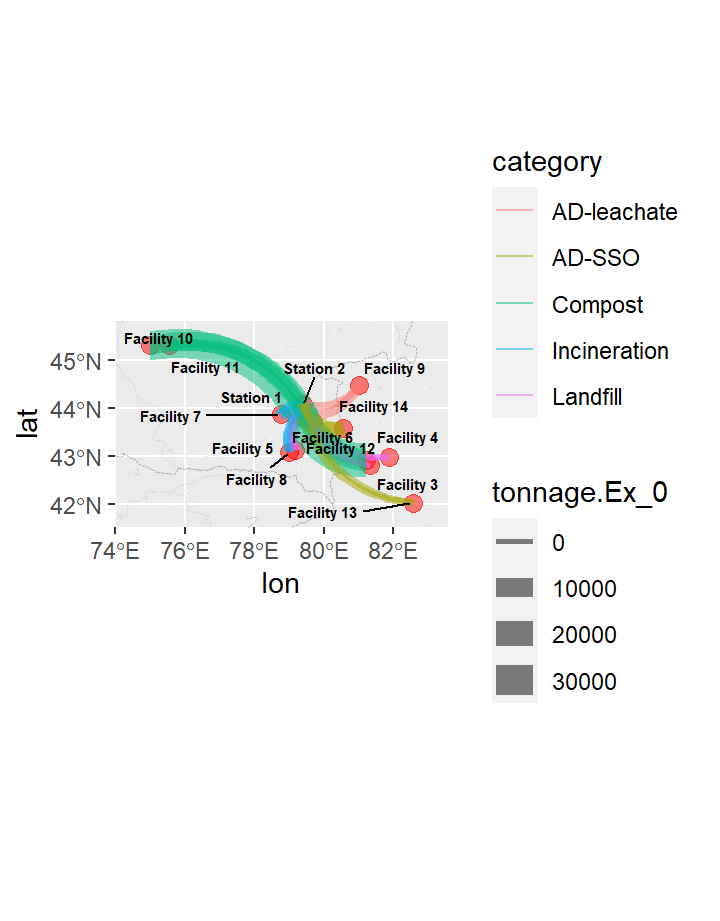
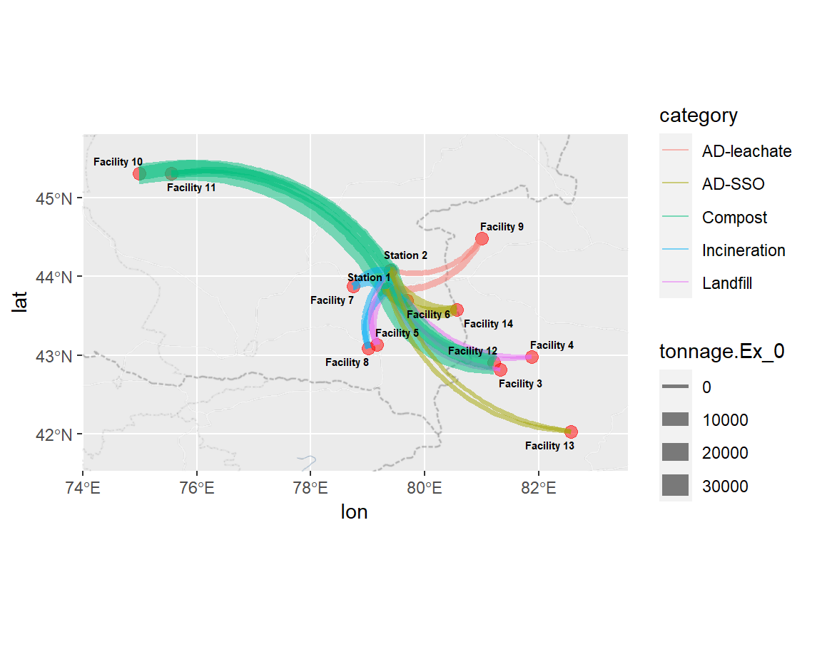
Where are the facilities relative to the transfer stations? Will some transportation emissions associated with these facilities be disproportionate due to haulage distance?Reading layer `YR-FoodWaste' from data source `C:\Users\HoJa\Documents\R\passerium\data\YR-FoodWasteADaltered.kml' using driver `KML'
Simple feature collection with 14 features and 2 fields
geometry type: POINT
dimension: XYZ
bbox: xmin: 74.99062 ymin: 42.02855 xmax: 82.56345 ymax: 45.3053
epsg (SRID): 4326
proj4string: +proj=longlat +datum=WGS84 +no_defsMapping it out >>
preparing for next stage
#create edge & node join for plot based on r-bloggers 2018 method #https://www.r-bloggers.com/2018/05/three-ways-of-visualizing-a-graph-on-a-map/

#making connectors
locs_lat_lon<-dplyr::select(locs_lat_lon, index, X,Y, Name)

edges_for_plot <- links %>%
  inner_join(locs_lat_lon %>% dplyr::select(index, X, Y), by = c('source' = 'index')) %>%
  rename(x = X, y = Y) %>%
  inner_join(locs_lat_lon %>% dplyr::select(index, X,Y), by = c('target' = 'index')) %>%
  rename(xend = X, yend = Y)
Showing where the facilities are and trying to demarcate type of process undertaken there, as well as sizing markers by annual tonnages received.
Then, create edges & nodes join to ready for connectors.
Catapaulting >>
Food waste-hurling fun - Creating weighted arrows showing flows from transfer stations (1,2) to the facilities (3 through 14)
!The Judgement
TBD - mini bar charts at each location showing treatment emissions vs. transport